Friday, February 21, 2025

Module 6 - Proportional Symbol and Bivariate Choropleth Mapping

 For this lab, we created three different maps that utilized proportional symbols and bivariate choropleth mapping. The outcome of this lab was the ability to create meaningful proportional symbol maps, create custom legend designs by manipulating graphical elements, prepare data for use in bivariate choropleth mapping, apply classification methods to multiple variables, and then create a bivariate color scheme using the HSV color system. 

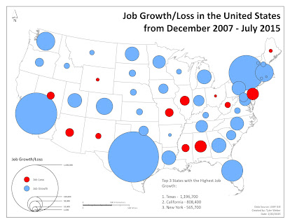
The first map I want to discuss with you is a map that uses proportional symbols to showcase job growth or job loss from December 2007 through July 2015 in the United States. To make this map I needed to create two different data sets from the same values, one for job growth, and the other for job loss. This was because proportional symbols do not work with negative values and the job loss was obviously reported in negative values. So once that was fixed I ran into an issue where the proportional symbols for job growth weren't matching job loss for the same value. This was important because I did not want to utilize two nested legends for datasets that utilize the same type of numerical unit. So after a while of messing with the point sizes to match, I realized I could just import the symbology from one layer to another which I did for positive to negative. The order for the symbols goes from largest to smallest, so the larger the symbol that is blue the higher the number of jobs. The same goes for the red symbols.


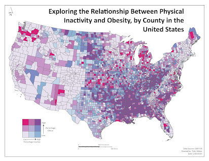
The next map I want to discuss is a bivariate choropleth map that I made that depicts the correlation between obesity and physical activity in counties within the United States. To prepare this data I needed to create three additional fields to assign a value for each corresponding value. One is for the percentage inactive, one is for the percent obese, and the last is for combining the two values together. To equally assign the values I needed to create a graduated symbol layer that depicts 3 classes for the percent obese and percent inactive via a quantile method. This allowed me to identify three percentage ranges to assign the values for those fields. So I selected by attribute for any value that was <=29 and so on. Once I did that I calculated the field for the class and assigned a numerical value of 1-3 for each class percentage breakdown. I did the same for physical inactivity but assigned an alphabetical value of A-C. Once I got those two fields filled out I calculated the last field to combine the two fields to create an alpha-numerical value that showcases how obesity and inactivity correspond with one another. Instead of using the bivariate option for symbology, I utilized unique values and created nine squares of color. To get to my final map color scheme, I utilized a color brewer to pick 6 classes, divided into three per variable to pick the colors that correspond with obesity and inactivity. Then to get the combining color hue I changed the transparency of one set of colors to 50% and overlayed it on top of the other to see how the colors can combine. The map you see below is the final outcome.

Friday, February 14, 2025

Module 5 - Analytical Data

This week's lab was an introduction/precursor to our final project. The objective of the lab was to practice the use of several different data visualization techniques. These techniques included bar charts, scatter charts, and pie charts, as well as the design of communicating materials that combine maps and other graphics (i.e. the charts). To begin, we had to choose two sets of normalized variables from County Health Ranks & Road Maps 2018 data. The two variables I chose to explore were the percentage of smokers and the percentage of individuals who reported fair/poor health. The reason for choosing these two variables is that smoking has been a major health issue for a while now. It may not be as big of an issue as obesity and heart disease, but with the rise of e-cigarette usage in more and more individuals are smoking I wanted to explore the correlation between smoking and fair/poor health reporting to see how much smoking is impacting the reporting of that variable. To best present this data I created two choropleth maps each depicting their corresponding variable. I went with an orange-to-red high-contrasting hue to direct attention to the high values of fair/poor health being reported. For the smokers map I went with a varying degree of green color hues to showcase smoking areas, seeing how tobacco is a green color I thought it would be best to depict the map as such. I also made it so that the darker the color, the higher the concentration of tobacco smokers located in that county. The charts I showcased are a scatterplot, bar chart, and pie chart. For the scatterplot, I made the y-axis Poor/Fair Health % and the x-axis adult smoking %. By formatting it this way it is easy to spot any correlation between the two variables. The bar chart highlights the top three countries with the highest and lowest smoking percentages and their corresponding health percentages. This helps the reader visually see the correlation between the highest and lowest values to see the drastic difference. The pie chart depicts the 2018 percentage breakdown of tobacco users to non-tobacco users. While what I wanted to do was showcase what products that 19.7% were made of via the pie chart, I wasn’t sure how to go about doing that. The percentages of those products also don’t add up to 19.70% because respondents reported multiple tobacco product uses, so to combat that I added the percentages and added a note to give the reader more clarity on what is being presented. I made sure the infographic utilized complementary color schemes throughout the maps and charts and ensured that the colors remained consistent with what the data presented on the charts. I opted to use a consistent sans-serif font throughout and reserved boldness for headers and subtitles. Overall I'm pretty proud of my resulting infographic but I know it can be improved upon significantly with more research into the subject variables I chose. Here is the Infographic:


Wednesday, February 5, 2025

Module 4 - Color Concepts & Choropleth Mapping

 I'm not going to lie, but this week was a kind of difficult lab. Mainly from the perspective of choosing the correct colors, and color ramps to properly present the data. Choosing colors has not been my strong suit but this lab definitely opened my mind up to more ways of choosing them. The objective of this lab is to experiment with using color in ArcGIS Pro, prepare data for choropleth mapping, and to create meaningful choropleth maps for different types of quantitative data. The first thing I want to discuss with you is the differences between three color ramps, linear, adjusted, and ColorBrewer.

Linear                       Adjusted                  ColorBrewer 


The linear and adjusted progression color ramps are very consistent with their progression from dark to light. Linear though seems to cause the viewer to have a more difficult time discerning between some colors. This can be a result of uniform increments of RGB progression that potentially cause the appearance that colors are blending. The adjusted is a bit similar but the hue and saturation seem to be more discernable between the colors. The color brew ramp ensures that the hue, saturation, and brightness of the colors are balanced and the differences between the various colors are clear. Color brewer also ensures that the colors best convey the differences between each value. It avoids banding and gives a more natural feel to the viewer. Colorblindness is something that Colorbrewer tries to appeal to by ensuring that even for a color-blind user the colors are distinct. The linear and adjusted color ramps above would not be good for accessibility as it doesn’t conform to showcasing distinct differences as well as the colorbrewer does.

The next thing I want to discuss with you is Chloropeth mapping. We were tasked with taking data from the US counties data layer and choosing between the states of Colorado, Georgia, and North Dakota. I went with Colorado. The next step was to then normalize the data by calculating population change from 2010 to 2014 and using this formula: (new value - old value)/(old value)*100. Once the data was normalized I wanted to present my data via a natural breaks classification method because I wanted to ensure that the data properly showcased the natural distribution of data by following the natural changes. I used 6 classes to showcase an even distribution of positive and negative values, and I went with a blue-to-red color ramp to match that positive-to-negative connotation. I place my legend as a linear ramp that fills the bottom of the page to best fill the white space within the figure. I also made it so that the center of the legend was the center of the percentage values. Here is the resulting map:


Final Project and other maps created

 After eight weeks this class has come to its conclusion. Our last task was to come up with a project idea that is geographic and meaningful...