After eight weeks this class has come to its conclusion. Our last task was to come up with a project idea that is geographic and meaningful. The project I came up with is exploring the possible correlation between hotdog and beer prices within Major League Baseball stadiums and the cost of living index score of the metro area in which these teams reside. The infographic I created is a mixture of bivariate choropleth for the hotdog and beer prices and a choropleth for the cost of living. The report I wrote that goes into detail about my findings can be found here.
But the gist of it is that after identifying the prices of hotdogs and beers and analyzing how those prices may correlate to the cost of living, it can be concluded that there are more factors outside of just the cost of living that may factor into the prices of these products. Some of those factors may include team sponsorship, distance to distributors, level of income a team brings in each year, and attendance of fans to each game. It can also be concluded that the cost of living has a larger impact on hotdog prices than beer prices, however minuscule it may be the data trend suggests it. For fans who want to acquire the cheapest hotdog, and cheapest beer prices at the same time, and who reside within a relatively low to neutral cost-of-living will want to visit the Arizona Diamondbacks’ Chase Field, the Atlanta Braves Truist Park, and the Minnesota Twins Target Field. Here is the infographic that I created.
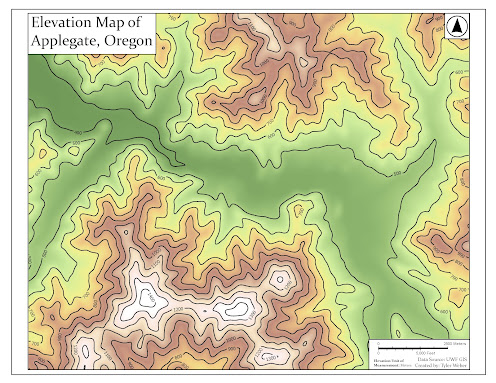
Now, I want to showcase some other maps that I created in this class. I am pretty proud of how they turned out. They weren't originally posted because they weren't required for the original blog post of their associated module.
This map was originally a conservation-focused map, but we were tasked with taking this data and formatting the layout to be something that a company would utilize. So, as someone who works for a company, I took inspiration from the layouts that I create and utilize almost every day.


