Thursday, March 21, 2024

Map Evaluations - Computer Cartography

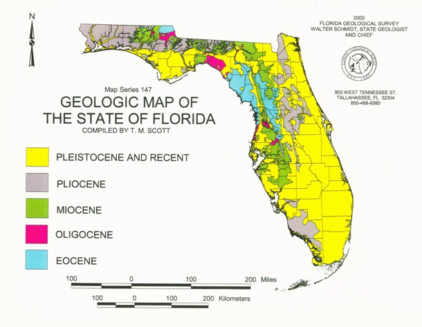
 For this weeks lab, we were tasked with evaluating two maps types, a good map and a bad map. The point of the lesson is analyze different map types that may assist us student in finding our cartographic aesthetic. Finding our cartographic aesthetic will then allow us to hon in on my very own cartographic style that follows the established cartographic design principles. When analyzing our good map and bad map, we had to answer questions regarding what makes each map a good or bad one. The good map I chose is a geologic map of the state of Florida and the bad map is a map showing post-extinction sightings of the Thylacine.

Here is my good map and the synopsis of why this is a good map:

General

  • What is the purpose (substantive objective) of the map?

The purpose of this map is to display the geologic history of the state of Florida in the year 2000.
  • What is the “look and feel” (affective objective) of the map?

The look of this map is very colorful, it feels like the creator of the map is using the colors to easily
distinguish between the geologic time periods. If you have colors that easily merge with one another,
it’s easy to not be able to see clearly between the different layers. 
  • Who is the intended audience for the map (include expected educational level)?

The intended audience of this map seems to be college educated individuals working in local or state
agencies. This map can also be used in construction planning reports to show what kind of geology can
be expected at the location. At my current job, we included a geologic survey map like this in the
construction planning report. So, another intended audience outside of state or local agencies are
construction and environmental professional services.  

Cartographic Design

  • Is there appropriate visual emphasis on important themes?

It seems that one visual emphasis they made was that the more colorful areas are older in the geologic
time scale and the newer they are the more neutral the color becomes.
  • Is the symbology for qualitative and quantitative data effectively applied?

I’d say that both the qualitative and quantitative data is effectively applied, it shows the location of
where the oldest to youngest geological areas are located to make it observable and being able to
understand which area is older geologically due to the order it is displayed in the legend.
  • Do the colors and symbols support the substantive and affective objectives?

Yes, I would say that it does support these objectives.
  • Are the symbols and labels legible?

The symbology is very legible, you’re able to clearly distinguish etween each value being represented.
There are no labels in this map.
  • Are the symbols intuitive and easy to decipher or do they have good explanation?

Yes, it is pretty easy to decipher and no explanation is needed.
Is there appropriate use of graphics, images, text blocks, or other supporting information?
Absolutely, it is important to include information about who made it so that if used in sort of
documentation, the author of the map can be properly cited. The graphic and text also offers a
good filler of white space and doesn’t take away from what the map is trying to portray.

Map Elements & Page layout

Does the page look balanced—are the map and map elements aligned to the page and to
each other? 
I’d argue that this map is perfectly aligned. Florida is definitely a hard shape to make balanced on maps
sometimes, but this particular map was able to make everything seem balanced.
  • Do all the map elements support the substantive and affective objectives?

Yes they do.
  • Are the map elements placed logically on the page?

I would say so, whenever I make maps I always put the scale at the bottom and north arrow in the top
left or right. The legend placement makes sense to fill up space and the same goes with the title. 
  • Does the map have appropriate borders?

There aren’t any clear borders but you are able to distinguish where the border cutoff is due to the maps
background color, I do know that in some reports borders might not be necessary and it can be a good
thing for the map to merge with the background. But that doesn’t happen often enough.
  • Scale

    • Is the scale (map extent) appropriate to the map?

Absolutely, it shows the entire state of Florida perfectly and doesn’t cut off any part of the state.
  • Is the scale bar appropriately designed, positioned and sized?
Yes, the map author used two scales in two different measurements using the same numerical values
but the length of the scales corresponds with their unit. It is positioned in the perfect spot at the bottom
of the page.
    • Are the scale units logical?

Yes, they used both miles and kilometers which I think is perfect and smart of them. People outside the
agency might not know miles which is why it’s important to include kilometers.
  • Legend

    • Have all the necessary symbols and details been included in the legend as they appear on the map (size, color, etc)? 

Yes everything matches.
    • Is there a logical structure related to the function of the legend?

      • Yes, from top to bottom it is in the order of most recent period to oldest period.

    • Are the legend labels logical?

Yes, if you know what each legend label means and have an understanding of the subject, it is logical.
  • Titles and Subtitles

  • Are the titles and/or subtitles present and suitably descriptive (area mapped, subject, date, etc)?
Yes, all of the necessary information is included.
    • Are the titles and/or subtitles suitably positioned and sized?

Yes, it fills the page nicely and you are able to clearly identify which titles are important and which
ones are just subtitles.


Here is the bad map and the synopsis why it is a bad map:


General

  • What is the purpose (substantive objective) of the map?

This map is a map I found scrolling on an extinct animals subreddit, it is supposed to depict sightings of
the Thylacine post-declaration of the animal being extinct.
  • What is the “look and feel” (affective objective) of the map?

The map makes it feel and look like the Thylacine can be found all over Australia and in certain areas of
neighboring countries. It makes it feel like the Thylacine is no-longer extinct.
  • Who is the intended audience for the map (include expected educational level)?

I think the intended audience of this map is anyone interested in the existence of extinct animals still
being alive or cryptid zoologists. You don’t necessarily need a high education level to understand sight
location maps but you probably do need a college level education to understand why these sighting
locations may correlate to the Thylacine’s old habitats. 

Cartographic Design

  • Is there appropriate visual emphasis on important themes?

Yes, the red is meant to depict areas where the Thylacine has been spotted post-extinction and I believe
that is the important theme of this map.
  • Is the symbology for qualitative and quantitative data effectively applied?

Not really, quantitatively the data is being shown but the way it is being shown is not effective. If they
really wanted to demonstrate where the the Thylacine has been sighted they can use a point density
method if the points are many or if there aren’t as many points to depict in that manner, just use plain
old points. In the current manner that the map is showing people where the Thylacine has been sighted
can be confusing, people may think that they can be found anywhere within the areas in red when in
reality it could be small isolated areas.
  • Do the colors and symbols support the substantive and affective objectives?

It supports what it is trying to show but could be shown in a much better manner.
  • Are the symbols and labels legible?

No labels were used and the red symbol is easy to decipher between non-red areas.
  • Are the symbols intuitive and easy to decipher or do they have good explanation?

I’d say it is easy to understand and shouldn’t need much explaining.
Is there appropriate use of graphics, images, text blocks, or other supporting information?
I don’t believe there is enough, the only bit of text is in the legend and that is the only way to know
what the map is trying to depict. It could use more information such as the source of this data, the
number of total sightings, the agency that may or may not have sponsored the map and collected the
data, who made it, etc.

Map Elements & Page layout

Does the page look balanced—are the map and map elements aligned to the page and to
each other? 
No, the map is not balanced, the legend can be positioned much better and the map should focus only
on areas where the Thylacine historically used to live. 
  • Do all the map elements support the substantive and affective objectives?

The legend does, but there is no other map element included.
  • Are the map elements placed logically on the page?

The legend kind of, but like I said before it could be positioned in a much better place such as below
Australia and make the text two lines instead of one line.
  • Does the map have appropriate borders?

There aren’t really any clear borders to mark where the map starts and where it ends.
  • Scale

    • Is the scale (map extent) appropriate to the map?

It could be better projected and focused on the Thylacines historic range instead of islands where
scientist know they have never lived in. That means focusing only on Tasmania, Australia, and the islands
of New Guinea.
    • Is the scale bar appropriately designed, positioned and sized?

There is no scale bar included on this map.
    • Are the scale units logical?

If the scale was included, I would hope so.
  • Legend

Have all the necessary symbols and details been included in the legend as they appear on the map
(size, color, etc)? 
Yes, the legend is really the only thing that looks right and correlates with what the map is depicting.
    • Is there a logical structure related to the function of the legend?

The only purpose the legend is showing is that anywhere that is red, a thylacine was spotted in that
territory.
    • Are the legend labels logical?

Yes the legend label is what gives context to what the map means in this specific map.
  • Titles and Subtitles

  • Are the titles and/or subtitles present and suitably descriptive (area mapped, subject, date, etc)?
The map author did not include any of this.
  • Are the titles and/or subtitles suitably positioned and sized?
The map author did not include these features, and in the current format it would be difficult to include
that information.

Looking at these maps, you can easily see the difference in overall quality and design of the them. The bad map doesn't even have a scale or north arrow. It's that bad, but that could just mean that the individual who made it doesn't know a map might necessarily need those. You can obviously tell that the individual who made the good map knows what they're doing. 

After analyzing these two maps, I believe I can better understand what my cartographic aesthetic is and how I can use it in furthering my education and career.

No comments:

Post a Comment

Final Project and other maps created

 After eight weeks this class has come to its conclusion. Our last task was to come up with a project idea that is geographic and meaningful...